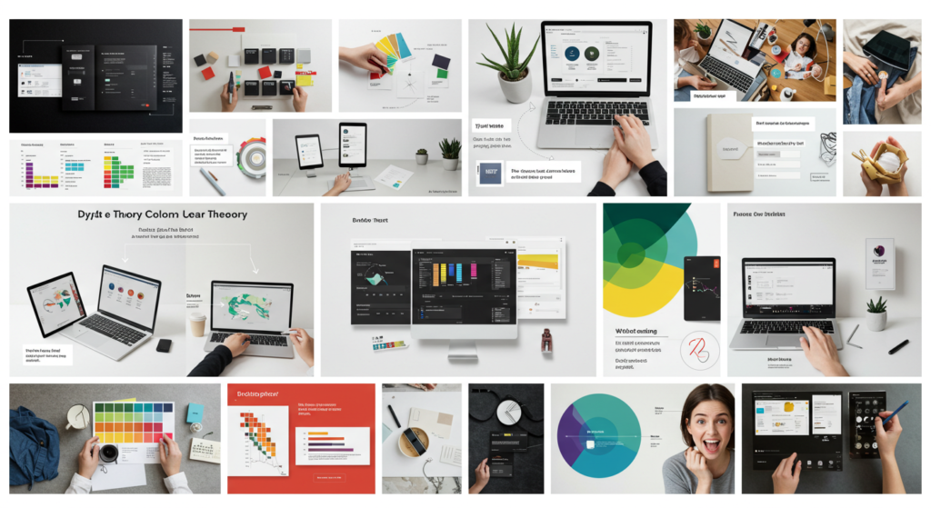
Introduction
Color is one of the most powerful tools in a graphic designer’s arsenal. When used effectively, it can evoke emotions, guide viewer behavior, and create a lasting brand impression. In this post, we’ll break down the essentials of color theory into five easy lessons that will help you transform your design projects. Whether you’re a seasoned designer looking to refresh your skills or a beginner ready to explore the world of color, these lessons will serve as your design color guide to mastering color theory basics.
Lesson 1: Understanding the Color Wheel
The color wheel is the cornerstone of color theory. It displays primary, secondary, and tertiary colors in a circle that shows their relationships at a glance. By studying the wheel, you can easily identify which colors work well together and create visual harmony. This foundational lesson helps you understand the interplay between different hues and sets the stage for more advanced concepts.
Lesson 2: The Psychology of Color
Every color conveys a unique message and evokes a distinct emotion. For instance, blue is often associated with trust and calmness, while red can evoke energy and passion. Understanding color psychology allows designers to choose palettes that resonate with their target audience. This lesson dives into the emotional impact of colors and how you can harness this knowledge to make your designs more compelling.
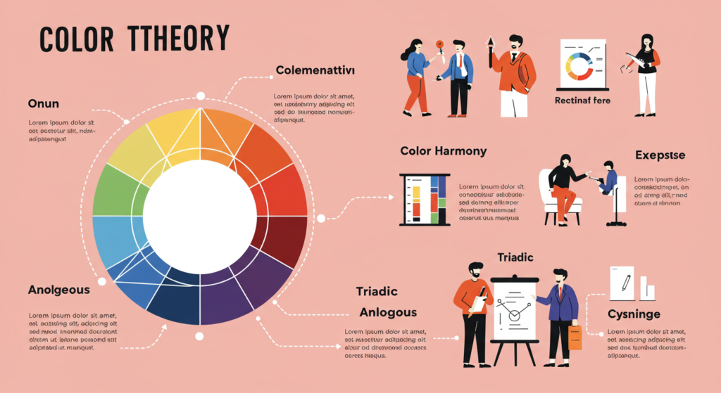
Lesson 3: Creating Color Harmony
Creating a harmonious color palette is key to effective design. This lesson explores various methods for achieving color balance—such as complementary, analogous, and triadic schemes. Learn how to combine colors to create a pleasing visual experience that enhances your design’s overall impact. A well-balanced color scheme not only grabs attention but also reinforces your message.
Lesson 4: Using Color in Branding and Design
Color is integral to a brand’s identity. In this section, we’ll discuss how companies leverage color to build recognition and evoke certain perceptions. From logos to websites, the strategic use of color can help solidify your brand image. We’ll also share practical tips on selecting color palettes that align with your brand’s personality and values.
Lesson 5: Practical Tips for Applying Color Theory
Theory is only as good as its application. In this final lesson, we provide actionable tips for integrating color theory into your design process. Explore free online tools that allow you to experiment with palettes, learn how to use gradients effectively, and test your designs in real-world scenarios. These practical insights will empower you to apply color theory confidently in every project.
Conclusion
Mastering color theory is a journey that begins with understanding the basics and evolves through practice and experimentation. By following these five lessons, you’ll not only grasp the fundamentals of color but also learn to apply them in ways that elevate your designs. Embrace the vibrant world of color and watch your creative projects come to life.